
Choose the Right Paint Colour for Home
Paint is the cheapest material in any renovation and the one that changes a room the most. A single wall can shift from cold and forgettable to warm and inviting with nothing more than a fresh coat, which is why so many homeowners start their search for the best interior paint colours before they touch anything structural.
Choosing well takes more than flicking through a swatch fan at the hardware store. Light, orientation, furniture, and the mood a room is meant to hold all play a part, and getting the sequence right saves a great deal of second-guessing later. Most guides to the best interior paint colours focus on trends; the more useful approach starts with how a room actually functions.
Read more: Architecture melbourne
Why Paint Colour Matters in Interior Design
Colour is the fastest signal a room sends. Before a visitor notices the furniture or the finishes, they register the wall colour and form an impression of the space almost instinctively.Undertones matter more than most people expect. A white that reads clean and bright in a north-facing living room can look flat or slightly grey in a hallway with less natural light. Testing a colour in the actual room, at different times of day, remains the only reliable way to know how it will behave.
Get the base colour right and everything else in the room becomes easier to place. Furniture, artwork and soft furnishings all read differently against a well-chosen backdrop than they do against one picked in haste.
read more: Interior Designers Melbourne
Understanding Warm vs Cool Paint Colours for Your Space
Warm tones such as terracottas, soft ochres and muted reds tend to pull a room in and make it feel sociable. They suit living areas, dining rooms and anywhere people gather and linger.
Cool tones do the opposite. Pale blues, sage greens and soft greys tend to recede, which makes them well suited to bedrooms, studies and bathrooms where the goal is calm rather than energy. A north-facing room already flooded with light can carry a cooler palette without feeling sterile, while a shadier, south-facing room usually benefits from warmth to balance the lack of sun.
Neither family is superior. The right choice depends on how a room is used and how much natural light it receives across the day, not on which palette happens to be trending.
read more: Essential Modern Building Principles
How Interior Colours Affect Your Mood and Emotions
Colour psychology is not marketing gloss; it reflects genuine, well-documented responses. Blues and greens tend to lower the pulse and support rest, which is part of why they turn up so often in bedrooms. Yellows and warm oranges do the reverse, lifting energy in kitchens and living spaces where activity is welcome.
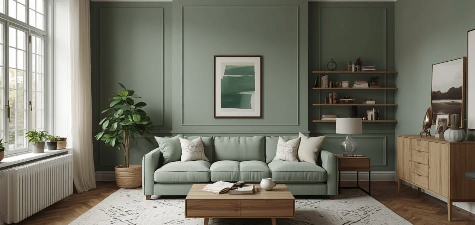
This is one of the reasons homeowners searching for the best interior paint colours often end up reconsidering the room’s purpose before its palette. A home office painted in a stimulating orange might photograph well, but it can make sustained concentration harder. A hallway in deep charcoal can feel dramatic in a photo and claustrophobic in person. Matching colour to function, rather than to a single striking image, tends to produce rooms people actually enjoy living in over years, not just weeks.
read more: Architect in Glen Iris
What Is Biophilic Design and Why Does Colour Matter?
Biophilic design is the practice of bringing natural patterns, materials and colours into built spaces, on the theory that people feel calmer and more grounded near things that echo the outdoors. Colour is one of its simplest tools.
Earthy greens, clay-based terracottas, sandy neutrals and soft stone greys all draw on what already exists in the Australian landscape, and they tend to sit comfortably alongside timber, stone and other natural materials without competing for attention.
At DW Architects, we’re always more interested in how a palette makes a room feel to live in than how it performs in a single photograph.Colour, in this sense, becomes less about decoration and more about atmosphere: a quiet extension of the landscape a home sits within.
read more: Architect in Lorne
How to Test Paint Colours Before Painting Your Walls
Skipping the testing stage is the single most common reason homeowners repaint within a year. A colour on a small chip almost never matches the same colour spread across four walls.Sample pots solve most of this. Painting a section at least a metre wide, on more than one wall, shows how the colour behaves in morning light, afternoon light and after dark under artificial globes.
Some hardware stores now offer large adhesive swatches as an alternative to sample pots, which can be moved around a room before any paint is opened.Patience here is genuinely cheap insurance. A few days of watching a test patch shift through the day costs far less than a full repaint six months after moving in. Photographing the swatch at set times (morning, midday, evening under lamplight) gives a record to compare against, rather than relying on memory of how a colour looked the day before.
read more: Architect in Beaumaris
5 Interior Paint Colours Designers Recommend Again and Again
Certain colours reappear across projects for good reason: they are flattering in most light conditions and age well against changing trends. Warm white sits at the top of the list, offering brightness without the starkness of a pure, cold white.
Soft sage green follows close behind, prized for pairing naturally with timber and stone finishes. Warm greige, that soft blend of grey and beige, has become a reliable neutral for open-plan living areas because it shifts subtly with the light rather than looking flat. Charcoal, used sparingly on a single feature wall or joinery, adds depth without overwhelming a room the way a full-wall application can.
Terracotta clay rounds out the list, bringing genuine warmth into spaces that lean too cool. None of these are guaranteed to suit every home, but each has earned its place among the best interior paint colours through sheer consistency across very different rooms and light conditions.
read more: Residential Architects in Melbourne
Conclusion
Choosing an interior paint colour rarely comes down to a single “correct” answer. It comes down to understanding how a room is used, how light moves through it across the day, and how a homeowner wants to feel inside it.
Testing patiently, matching palette to purpose, and resisting the pull of whatever is trending this season will do more for a home’s interior than any single standout colour ever could. Long-term livability and a genuine connection to the surrounding landscape sit at the centre of how DW Architects approaches every residential project, colour choices included.
Recent Comments